As the days grow shorter and the air crisp, winter invites us to slow down, draw inward and surround ourselves with refined stillness. This mood board brings together tones that reflect snow-soft mornings, frosted landscapes and quiet luxury — from whites and greys to deep pine greens, winter blues and a pair of festive accents for sparkle and warmth.
Pour something warm, cozy up, and enjoy the read.
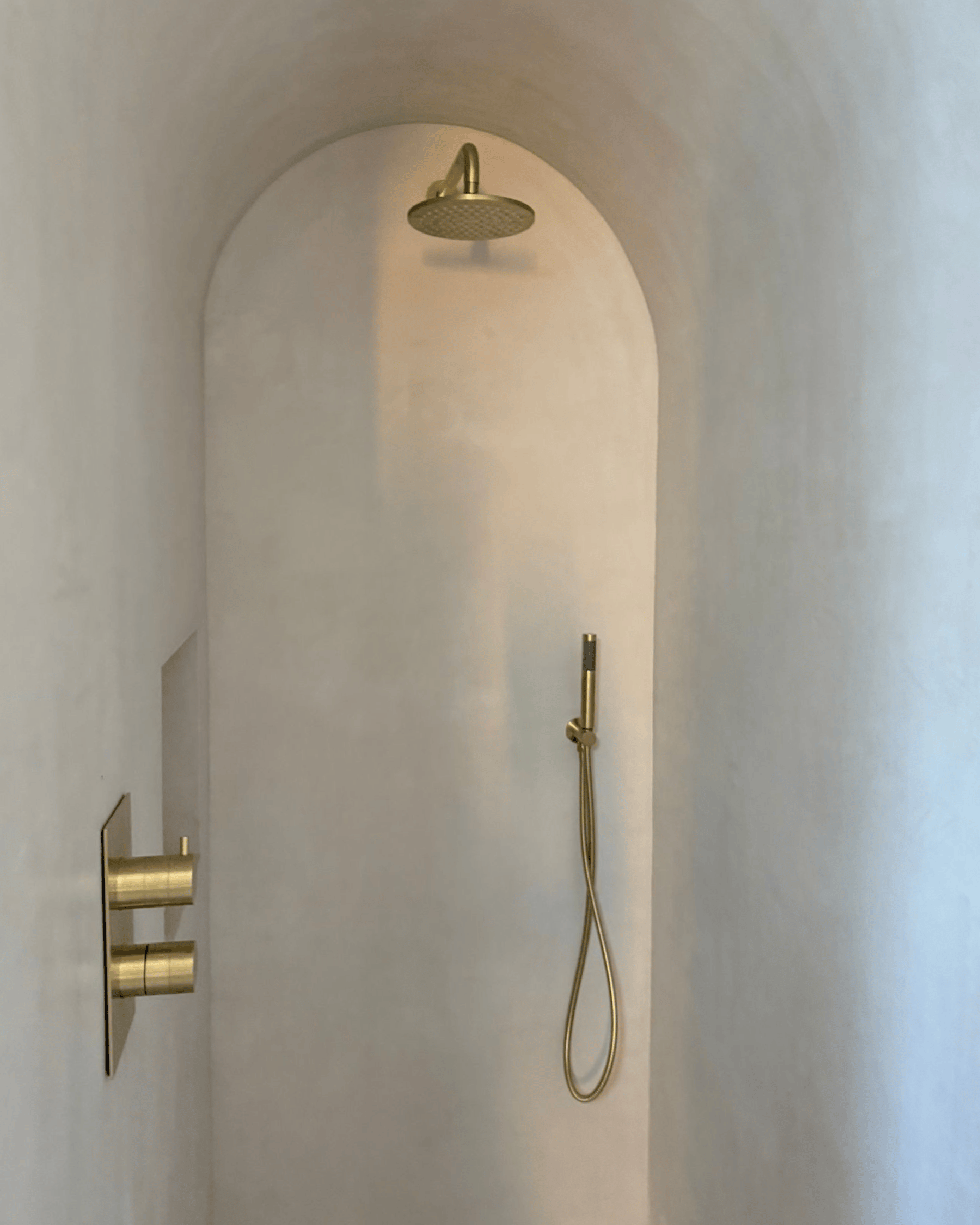
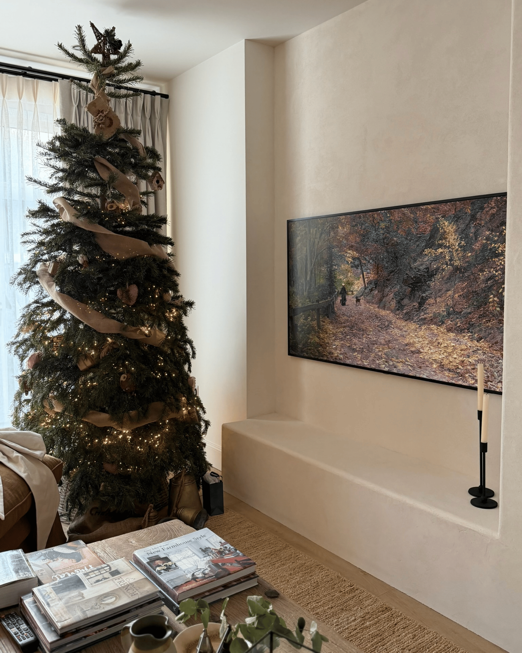
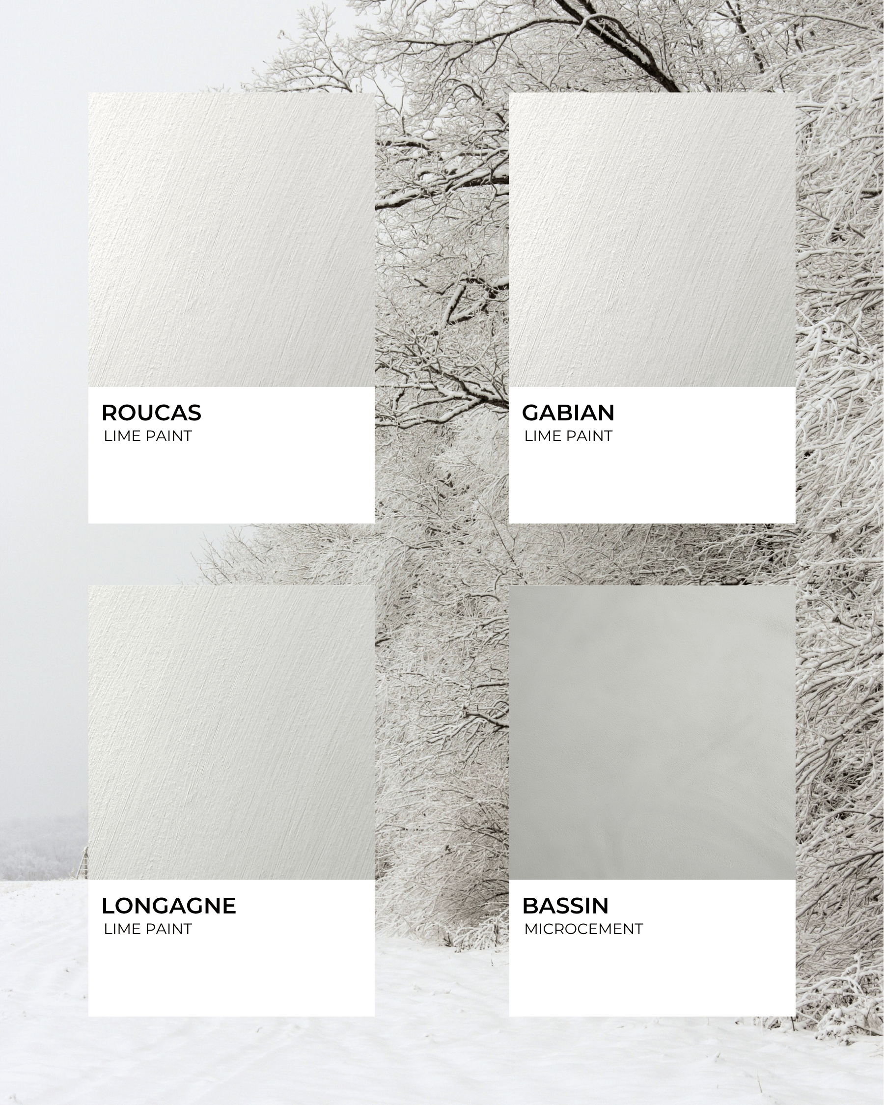
Crisp, clean whites, light greys and soft off-whites form the foundation of a serene winter palette. Think freshly fallen snow, frost-touched branches and light filtering through sheer curtains. These tones reflect light beautifully, amplify space and create a calm backdrop.
Mercadier matches: ROUCAS, GABIAN, LONGAGNE, BASSIN
Best for: bathrooms, kitchens, living rooms, Scandinavian-inspired spaces and minimalist open-plan designs.
Pairs well with: Natural wood, pale stone, brushed brass or chrome hardware, soft greys.
Mood tip: Use a pure white on trims and ceilings, and a slightly warmer off-white on walls to avoid sterility. Introduce texture (wool throws, linen cushions, looped rugs) to keep the white from feeling flat.
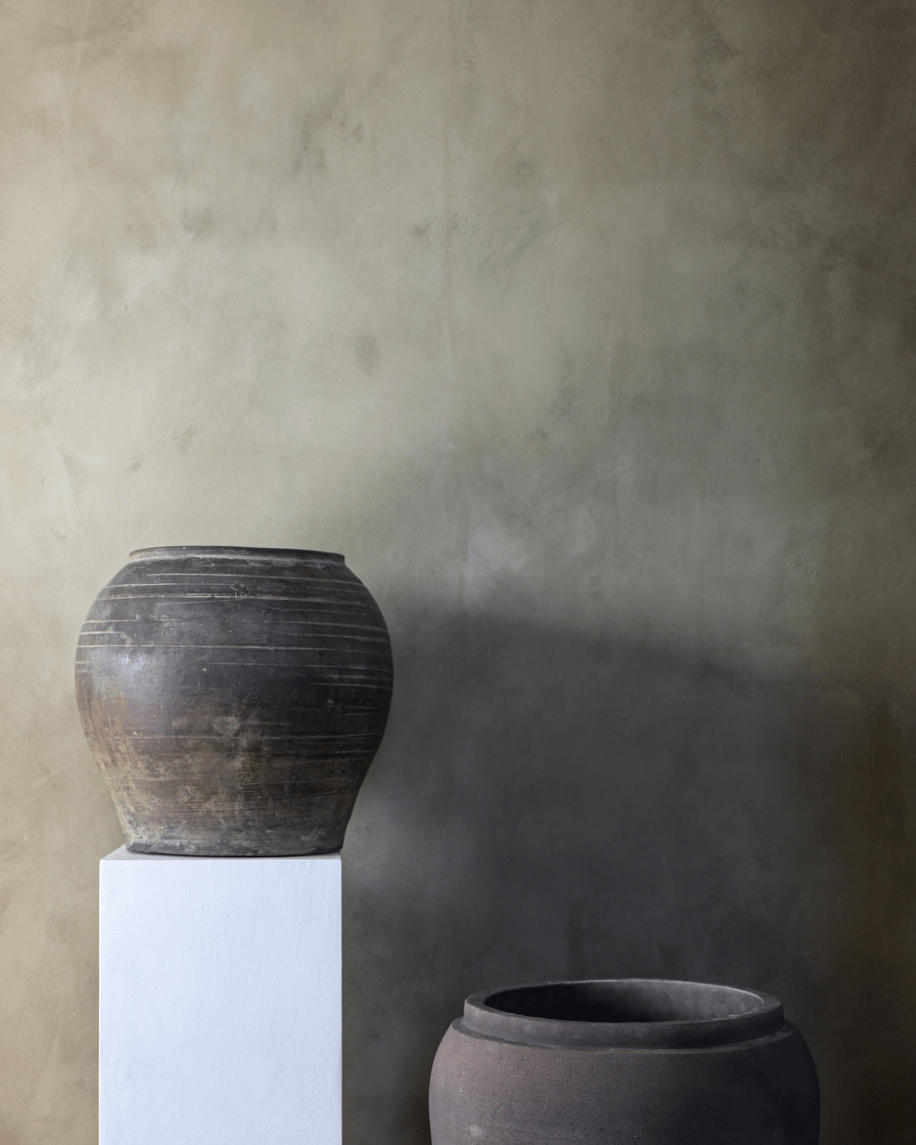
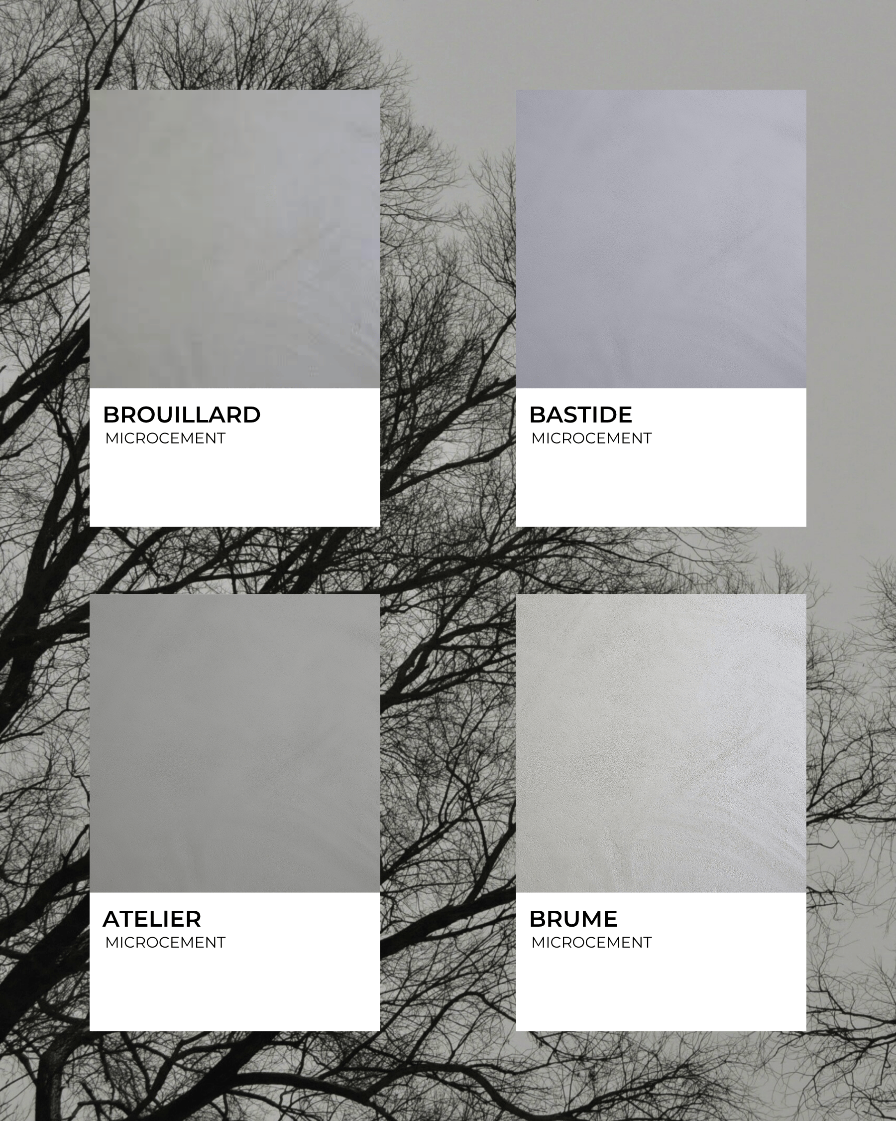
A mid-tone grey brings quiet sophistication and lends itself beautifully to winter interiors. It evokes the calm of overcast skies, the flicker of candlelight in low daylight. Greys provide depth without heaviness and serve as a neutral that complements nearly any accent colour.
Mercadier matches: BROUILLARD, BASTIDE, ATELIER, BRUME
Best for: home offices, reading nooks and contemporary living spaces.
Pairs well with: Whites, charcoals, metallic finishes, timber.
Mood tip: Choose a grey with warm undertones for comfort and layer with textiles in grey-toned patterns to add softness.
Charcoal tones bring drama, grounding and a grown-up edge to a winter scheme. Bring in the deep, soot-grey of a winter night, the charcoal of a roaring fire’s ashes. These dark shades anchor the room and allow lighter elements to shine.
Mercadier matches: NOIR EXTRA, MODÈLE, HUBERT, ZINC
Best for: feature walls, libraries, fireplaces, dining rooms, and modern industrial-style spaces.
Pairs well with: Whites and off‐whites for contrast, soft greys, brass and copper, deep greenery.
Mood tip: Use charcoal sparingly, as a feature, to keep the space open. Let it frame the lighter tones rather than dominate them.
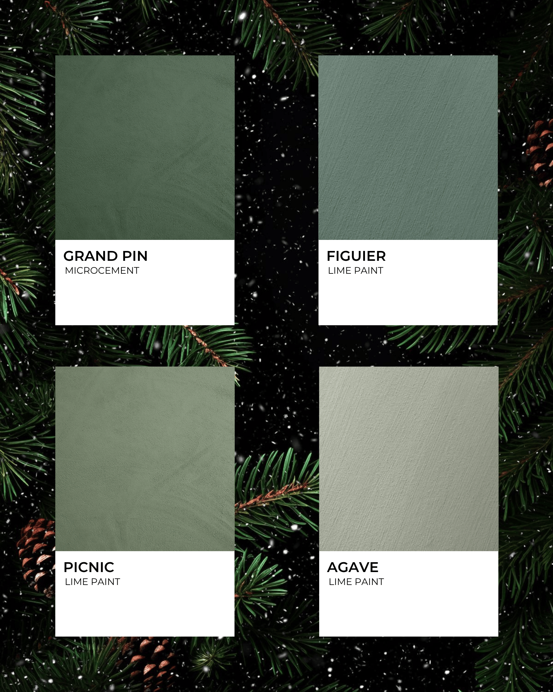
This rich green is rooted in nature and perfectly suited for winter. Think the deep green of pine trees in snow, moss-covered branches, the freshness of evergreens. It adds life, depth and a hint of seasonal woodland charm to an interior.
Mercadier matches: GRAND PIN, FIGUIER, PICNIC, AGAVE
Best for: entryways, bathrooms, powder rooms, boot rooms, kitchens, living rooms, reading nooks, playrooms and nature-inspired design schemes.
Pairs well with: Whites and off-whites, charcoals, brass hardware, natural wood, stone.
Mood tip: To keep the green from feeling “Christmas tree” only, pair it with modern textures, matte finishes and clean lines.
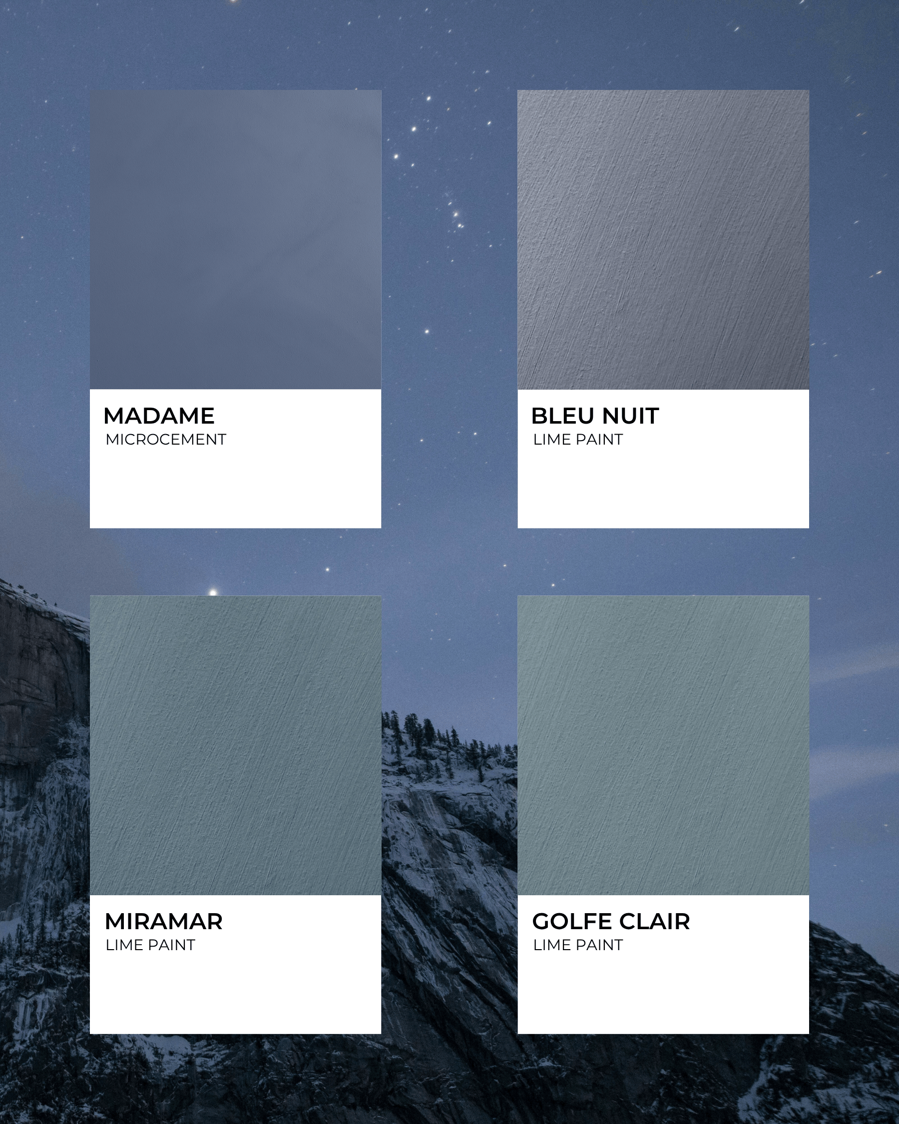
Seasonal blues — deeper, slightly muted — bring a quiet elegance and a sense of space and depth reminiscent of a clear winter twilight sky. These tones work beautifully as accent colours to bring visual interest without overwhelming.
Mercadier matches: MADAME, BLEU NUIT, MIRAMAR, GOLFE CLAIR
Best for: living rooms, dining rooms, feature walls, reading nooks, playrooms and sophisticated coastal-inspired schemes.
Pairs well with: Whites and off-whites, greys and charcoals, metallics (silver, chrome), pale woods.
Mood tip: Use a steel or slate blue for large surfaces, then layer with cushion shades or throws in warmer blue-tones to soften the effect and bring variation.
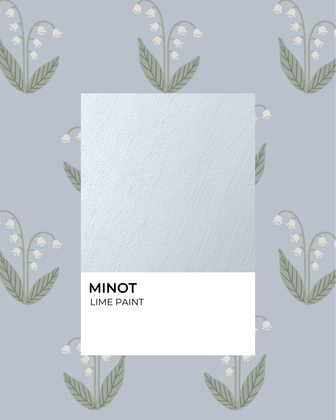
Soft, light blues evoke frost-touched windows, pale winter skies, and a gentle calm. These hues are perfect for creating restful retreats in winter — bedrooms, reading nooks, bathrooms — where the mood is quiet and composed.
Mercadier matches: L'ESTAQUE, SARTINE, MINOT, CÉLESTE
Best for: bedrooms, bathrooms and serene, spa-like retreat spaces.
Pairs well with: Whites, pale greys, brushed nickel/silver finishes, natural wood (light oak).
Mood tip: Keep the light blue as the dominant tone in a small space, and warm it up with a wood floor or textured linen fabrics. Avoid too many cool metallics to maintain a comfortable feel.

This deep, saturated berry red carries vibrant festive energy. Think mulled wine, cranberry sauce, the warmth of rich berry tones. Used sparingly, it offers a vivid accent that enlivens a quiet winter palette. For the bold at heart, it also rewards full commitment: a room drenched in berry feels enveloping, confident and beautifully expressive, turning a simple shade into a statement you truly inhabit.
Mercadier match: PRUNE
Best for: bathrooms, glam rooms, powder rooms, accent walls, and focal points in living spaces.
Pairs well with: Whites and off-whites, charcoals, pine green, brushed gold or brass accents, and similar tones.
Mood tip: Use berry as a statement to maintain impact. Match with similar tones and neutrals to create à full drenched look.
Warm gold metallics bring light, sophistication and a sense of celebration to winter interiors. They reflect candlelight and daylight alike, adding subtle sparkle and refinement without being overwhelming.
Mercadier match: LANDOLFI
Best for: living rooms, hallways, entertaining spaces and elegant decorative schemes.
Pairs well with: Neutral colours, wood, charcoals, natural stone and marble.
Mood tip: Pair with matte or brushed gold rather than high-gloss yellow gold for warmth and richness, or with matte black accents for contrast.
Winter is a season of quiet contrasts. Soft daylight meeting long evenings, the crispness of snow set against the warmth of a lived-in home. In interiors, these shades invite a slower rhythm, a chance to reflect and settle into a sense of thoughtful comfort.
Light tones, including whites, pale greys and soft blues, gain depth and interest when paired with richer hues such as charcoal, deep green or midnight blue. Together, they create a balance that feels both calm and considered.
As you imagine your next design, we hope our winter palette encourages you to savour the season and shape a home that welcomes slow living as well as moments of celebration with your loved ones.
Have a merry season, and a happy winter!


As the days grow shorter and the air crisp, winter invites us to slow down, draw inward and surround ourselves with refined stillness. This mood board brings together tones that reflect snow-soft mornings, frosted landscapes and quiet luxury — from whites and greys to deep pine greens, winter blues and a pair of festive accents for sparkle and warmth.
Pour something warm, cozy up, and enjoy the read.
Crisp, clean whites, light greys and soft off-whites form the foundation of a serene winter palette. Think freshly fallen snow, frost-touched branches and light filtering through sheer curtains. These tones reflect light beautifully, amplify space and create a calm backdrop.
Mercadier matches: ROUCAS, GABIAN, LONGAGNE, BASSIN
Best for: bathrooms, kitchens, living rooms, Scandinavian-inspired spaces and minimalist open-plan designs.
Pairs well with: Natural wood, pale stone, brushed brass or chrome hardware, soft greys.
Mood tip: Use a pure white on trims and ceilings, and a slightly warmer off-white on walls to avoid sterility. Introduce texture (wool throws, linen cushions, looped rugs) to keep the white from feeling flat.
A mid-tone grey brings quiet sophistication and lends itself beautifully to winter interiors. It evokes the calm of overcast skies, the flicker of candlelight in low daylight. Greys provide depth without heaviness and serve as a neutral that complements nearly any accent colour.
Mercadier matches: BROUILLARD, BASTIDE, ATELIER, BRUME
Best for: home offices, reading nooks and contemporary living spaces.
Pairs well with: Whites, charcoals, metallic finishes, timber.
Mood tip: Choose a grey with warm undertones for comfort and layer with textiles in grey-toned patterns to add softness.
Charcoal tones bring drama, grounding and a grown-up edge to a winter scheme. Bring in the deep, soot-grey of a winter night, the charcoal of a roaring fire’s ashes. These dark shades anchor the room and allow lighter elements to shine.
Mercadier matches: NOIR EXTRA, MODÈLE, HUBERT, ZINC
Best for: feature walls, libraries, fireplaces, dining rooms, and modern industrial-style spaces.
Pairs well with: Whites and off‐whites for contrast, soft greys, brass and copper, deep greenery.
Mood tip: Use charcoal sparingly, as a feature, to keep the space open. Let it frame the lighter tones rather than dominate them.
This rich green is rooted in nature and perfectly suited for winter. Think the deep green of pine trees in snow, moss-covered branches, the freshness of evergreens. It adds life, depth and a hint of seasonal woodland charm to an interior.
Mercadier matches: GRAND PIN, FIGUIER, PICNIC, AGAVE
Best for: entryways, bathrooms, powder rooms, boot rooms, kitchens, living rooms, reading nooks, playrooms and nature-inspired design schemes.
Pairs well with: Whites and off-whites, charcoals, brass hardware, natural wood, stone.
Mood tip: To keep the green from feeling “Christmas tree” only, pair it with modern textures, matte finishes and clean lines.
Seasonal blues — deeper, slightly muted — bring a quiet elegance and a sense of space and depth reminiscent of a clear winter twilight sky. These tones work beautifully as accent colours to bring visual interest without overwhelming.
Mercadier matches: MADAME, BLEU NUIT, MIRAMAR, GOLFE CLAIR
Best for: living rooms, dining rooms, feature walls, reading nooks, playrooms and sophisticated coastal-inspired schemes.
Pairs well with: Whites and off-whites, greys and charcoals, metallics (silver, chrome), pale woods.
Mood tip: Use a steel or slate blue for large surfaces, then layer with cushion shades or throws in warmer blue-tones to soften the effect and bring variation.
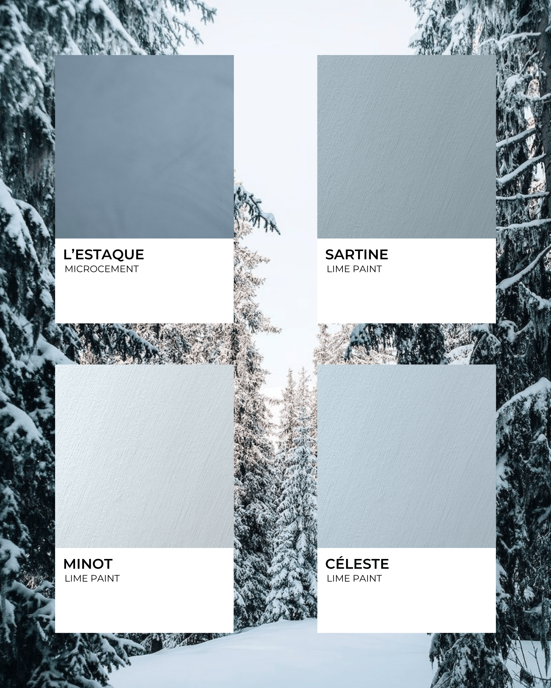
Soft, light blues evoke frost-touched windows, pale winter skies, and a gentle calm. These hues are perfect for creating restful retreats in winter — bedrooms, reading nooks, bathrooms — where the mood is quiet and composed.
Mercadier matches: L'ESTAQUE, SARTINE, MINOT, CÉLESTE
Best for: bedrooms, bathrooms and serene, spa-like retreat spaces.
Pairs well with: Whites, pale greys, brushed nickel/silver finishes, natural wood (light oak).
Mood tip: Keep the light blue as the dominant tone in a small space, and warm it up with a wood floor or textured linen fabrics. Avoid too many cool metallics to maintain a comfortable feel.
This deep, saturated berry red carries vibrant festive energy. Think mulled wine, cranberry sauce, the warmth of rich berry tones. Used sparingly, it offers a vivid accent that enlivens a quiet winter palette. For the bold at heart, it also rewards full commitment: a room drenched in berry feels enveloping, confident and beautifully expressive, turning a simple shade into a statement you truly inhabit.
Mercadier match: PRUNE
Best for: bathrooms, glam rooms, powder rooms, accent walls, and focal points in living spaces.
Pairs well with: Whites and off-whites, charcoals, pine green, brushed gold or brass accents, and similar tones.
Mood tip: Use berry as a statement to maintain impact. Match with similar tones and neutrals to create à full drenched look.
Warm gold metallics bring light, sophistication and a sense of celebration to winter interiors. They reflect candlelight and daylight alike, adding subtle sparkle and refinement without being overwhelming.
Mercadier match: LANDOLFI
Best for: living rooms, hallways, entertaining spaces and elegant decorative schemes.
Pairs well with: Neutral colours, wood, charcoals, natural stone and marble.
Mood tip: Pair with matte or brushed gold rather than high-gloss yellow gold for warmth and richness, or with matte black accents for contrast.
Winter is a season of quiet contrasts. Soft daylight meeting long evenings, the crispness of snow set against the warmth of a lived-in home. In interiors, these shades invite a slower rhythm, a chance to reflect and settle into a sense of thoughtful comfort.
Light tones, including whites, pale greys and soft blues, gain depth and interest when paired with richer hues such as charcoal, deep green or midnight blue. Together, they create a balance that feels both calm and considered.
As you imagine your next design, we hope our winter palette encourages you to savour the season and shape a home that welcomes slow living as well as moments of celebration with your loved ones.
Have a merry season, and a happy winter!