As the light softens and the air turns crisp, autumn gathers us into its embrace. There are slow walks through woodland paths, little hands clutching leaves in every shade of gold and crimson, and evenings spent by the fire with a favourite cup warming our palms. It is a season of texture and intimacy, where nature’s transformation outside inspires us to cocoon indoors with equal richness.
Our Fall Mood Board draws on the beauty of these cherished moments, showcasing tones that carry the warmth, depth and earthiness of the season into the heart of the home.
We hope you feel inspired.
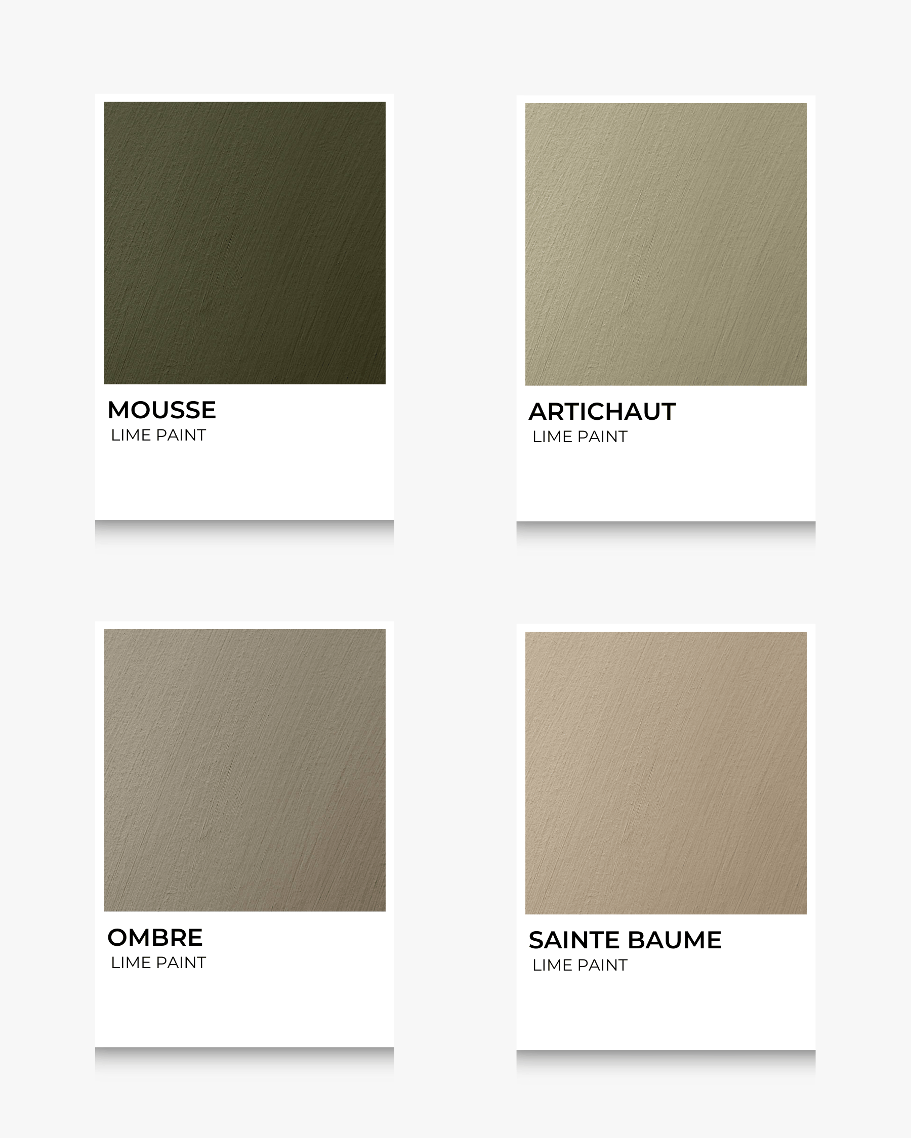
Deep and organic greens with brown undertones, like damp forest bark after rain. These tones bring a sense of protection, lushness, and life-moss into your room.
Mercadier matches: MOUSSE, ARTICHAUT, OMBRE, SAINTE BAUME
Best for: Accent walls, doors, cupboards, or fireplaces. It pairs beautifully with raw oak, clay pottery, and muted creams.
Pairs well with: Burnt orange, golden beige, dark bronze/aged brass hardware.
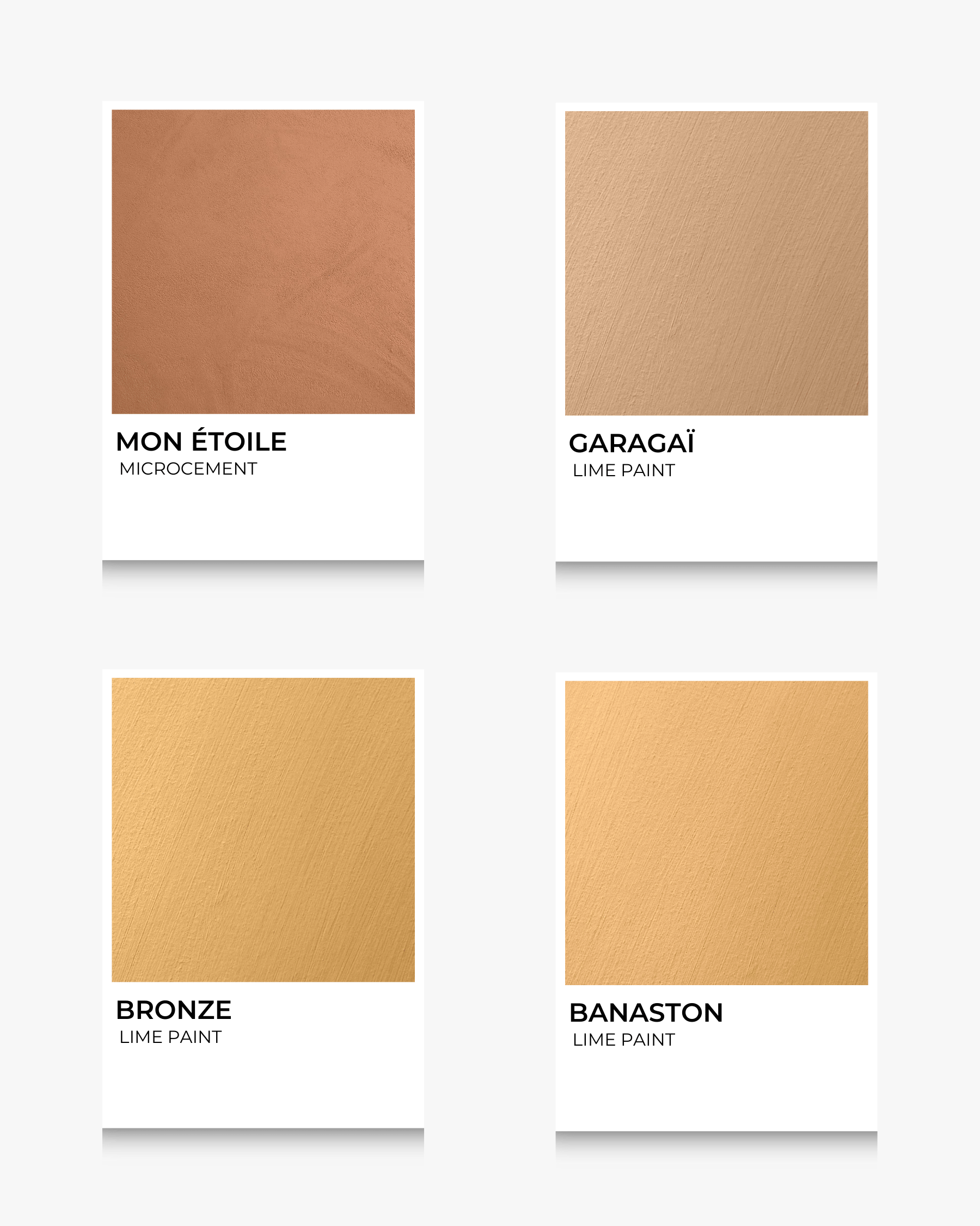
Warm sunlight through autumn leaves — golden ochres, honey, muted gold tones. These bring energy without overwhelming, turning any space into something cosy and glowing.
Mercadier matches: MON ÉTOILE, GARAGAÏ, BRONZE BANASTON
Best for: Entryways, kitchens, or spaces you want to feel radiant (sun-facing walls especially).
Pairs well with: Deep browns, cream fabrics, terracotta tiles, textured linen.
Aged brick, turned leaves, coppery wood tones and warm sienna— these bring dramatic warmth. Rich without being too dark, they evoke both comfort and richness.
Mercadier matches: TERRE, WABI, BRYCE, MÉCANIQUE
Best for: Accent walls, woodwork, or accessories like built‐in shelving.
Pairs well with: Olive and mossy greens, muted golds, soft vanilla or warm off-white tones.
More saturated than reddish browns: think deep rust, terracotta tones, the glow of fired clay. These are strong, statement colours. Use them to draw attention or create intimate cosy corners.
Mercadier matches: SANTOUN, ROUSTIDO, MALLON, RAVI
Best for: Fireplace surrounds, dining rooms, feature pieces like sideboards.
Pairs well with: Muted greys, warm woods (walnut, mahogany), textiles in cream, stone.
Deep purples, plum, aubergine — colours that feel luxurious, moody. They bring richness especially in low light, and work beautifully as accent or feature colours.
Mercadier matches: PRUNE, TINO ROSSO, BAKLAJAN, RUBAN DE VELOURS
Best for: Bedrooms, libraries, intimate boudoirs and cosy nooks or small details (a cupboard door, trims, alcoves).
Pairs well with: Mushrooms / greiges, gold/bronze metal finishes, soft creams, deep greens.
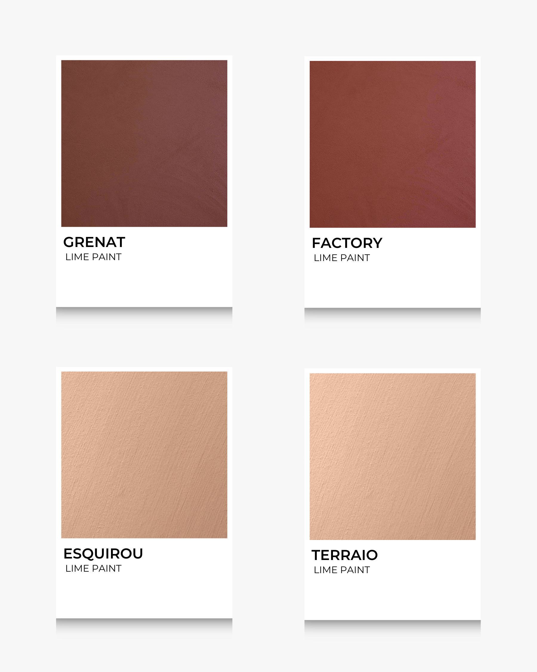
Rich caramel brown, warm mocha mousse, dark cacao. These are grounding, comforting, versatile. Great as main colour for walls or large surfaces.
Mercadier matches: GRENAT, FACTORY, ESQUIROU, TERRAIO
Best for: Living rooms, entire open living-dining spaces, kitchens.
Pairs well with: Creamy whites, deep greens, rich plums, rust or golden accents, woven textures.


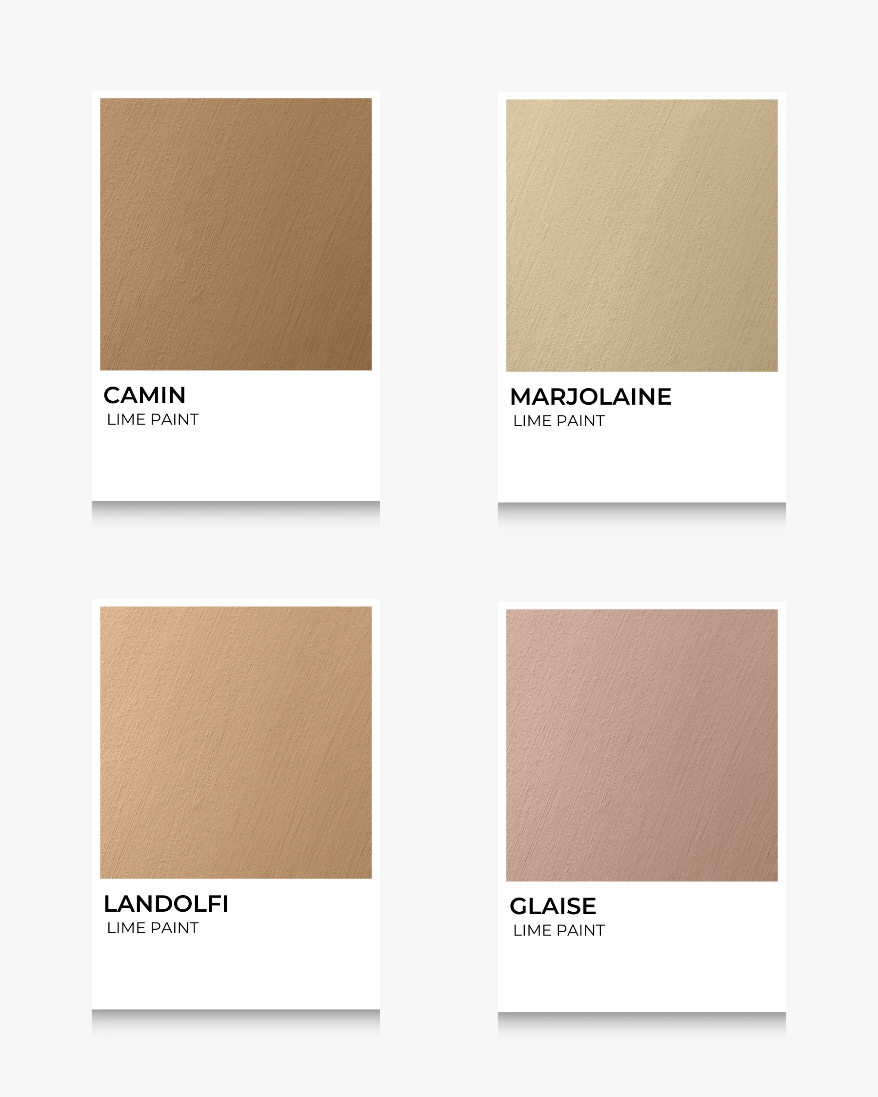
A softer, muted mix of greige and taupe shades — colours that act perfectly as a gentle backdrop and lets richer shades shine. Subtle, sophisticated, restful.
Mercadier matches: CAMIN, MARJOLAINE, LANDOLFI, GLAISE
Best for: Ceilings, trim, perhaps full rooms where you want calm, or to tone down contrast.
Pairs well with: Plush fabrics, raw wood, splashes of rust or plum, bronze fixtures.
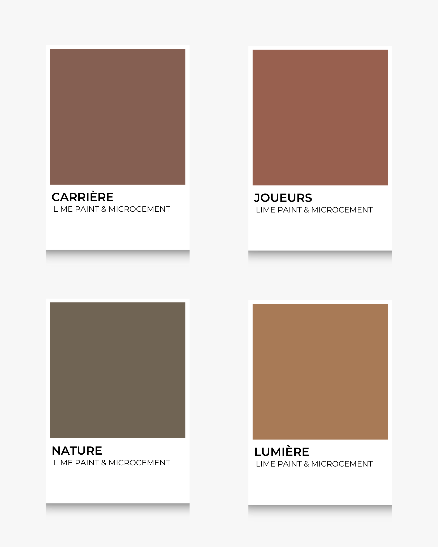
Our selection of autumnal shades from Mercadier's Sur les traces de Cezanne Collection :
CARRIÈRE, JOUEURS, NATURE, LUMIÈRE
Autumn is a season of contrasts, a choreography of warmth and shadow, saturation and restraint. Within interiors, these tones invite us to linger a little longer, to create spaces that feel layered and intimate. The deeper shades — plum, rust, sienna — sing most beautifully when set against softer mushroom and beige, a reminder that balance is key. What elevates these palettes is not only the colour but the play of texture: lime paint that catches light like shifting leaves, microcement that grounds a room with quiet strength, and natural finishes in wood, stone, and woven textiles that lend depth and authenticity. The result is an interior that doesn’t simply nod to autumn, but embodies it — cocooning, generous, and timelessly elegant.

As the light softens and the air turns crisp, autumn gathers us into its embrace. There are slow walks through woodland paths, little hands clutching leaves in every shade of gold and crimson, and evenings spent by the fire with a favourite cup warming our palms. It is a season of texture and intimacy, where nature’s transformation outside inspires us to cocoon indoors with equal richness.
Our Fall Mood Board draws on the beauty of these cherished moments, showcasing tones that carry the warmth, depth and earthiness of the season into the heart of the home.
We hope you feel inspired.
Deep and organic greens with brown undertones, like damp forest bark after rain. These tones bring a sense of protection, lushness, and life-moss into your room.
Mercadier matches: MOUSSE, ARTICHAUT, OMBRE, SAINTE BAUME
Best for: Accent walls, doors, cupboards, or fireplaces. It pairs beautifully with raw oak, clay pottery, and muted creams.
Pairs well with: Burnt orange, golden beige, dark bronze/aged brass hardware.
Warm sunlight through autumn leaves — golden ochres, honey, muted gold tones. These bring energy without overwhelming, turning any space into something cosy and glowing.
Mercadier matches: MON ÉTOILE, GARAGAÏ, BRONZE BANASTON
Best for: Entryways, kitchens, or spaces you want to feel radiant (sun-facing walls especially).
Pairs well with: Deep browns, cream fabrics, terracotta tiles, textured linen.
Aged brick, turned leaves, coppery wood tones and warm sienna— these bring dramatic warmth. Rich without being too dark, they evoke both comfort and richness.
Mercadier matches: TERRE, WABI, BRYCE, MÉCANIQUE
Best for: Accent walls, woodwork, or accessories like built‐in shelving.
Pairs well with: Olive and mossy greens, muted golds, soft vanilla or warm off-white tones.
More saturated than reddish browns: think deep rust, terracotta tones, the glow of fired clay. These are strong, statement colours. Use them to draw attention or create intimate cosy corners.
Mercadier matches: SANTOUN, ROUSTIDO, MALLON, RAVI
Best for: Fireplace surrounds, dining rooms, feature pieces like sideboards.
Pairs well with: Muted greys, warm woods (walnut, mahogany), textiles in cream, stone.
Deep purples, plum, aubergine — colours that feel luxurious, moody. They bring richness especially in low light, and work beautifully as accent or feature colours.
Mercadier matches: PRUNE, TINO ROSSO, BAKLAJAN, RUBAN DE VELOURS
Best for: Bedrooms, libraries, intimate boudoirs and cosy nooks or small details (a cupboard door, trims, alcoves).
Pairs well with: Mushrooms / greiges, gold/bronze metal finishes, soft creams, deep greens.
Rich caramel brown, warm mocha mousse, dark cacao. These are grounding, comforting, versatile. Great as main colour for walls or large surfaces.
Mercadier matches: GRENAT, FACTORY, ESQUIROU, TERRAIO
Best for: Living rooms, entire open living-dining spaces, kitchens.
Pairs well with: Creamy whites, deep greens, rich plums, rust or golden accents, woven textures.
A softer, muted mix of greige and taupe shades — colours that act perfectly as a gentle backdrop and lets richer shades shine. Subtle, sophisticated, restful.
Mercadier matches: CAMIN, MARJOLAINE, LANDOLFI, GLAISE
Best for: Ceilings, trim, perhaps full rooms where you want calm, or to tone down contrast.
Pairs well with: Plush fabrics, raw wood, splashes of rust or plum, bronze fixtures.
Our selection of autumnal shades from Mercadier's Sur les traces de Cezanne Collection :
CARRIÈRE, JOUEURS, NATURE, LUMIÈRE
Autumn is a season of contrasts, a choreography of warmth and shadow, saturation and restraint. Within interiors, these tones invite us to linger a little longer, to create spaces that feel layered and intimate. The deeper shades — plum, rust, sienna — sing most beautifully when set against softer mushroom and beige, a reminder that balance is key. What elevates these palettes is not only the colour but the play of texture: lime paint that catches light like shifting leaves, microcement that grounds a room with quiet strength, and natural finishes in wood, stone, and woven textiles that lend depth and authenticity. The result is an interior that doesn’t simply nod to autumn, but embodies it — cocooning, generous, and timelessly elegant.