Our very last major project of 2025 was commissioned by the talented Lynne O’Loughlin, the Galway-based, award-winning designer behind Lynne O’Loughlin Design.
Set within a beautifully proportioned terraced house near Galway’s promenade, this full renovation is about balance: honouring the building’s original character while gently introducing contemporary comfort, warmth, and subtle texture.
Through carefully considered finishes, colour drenching, and mineral-based materials, this classic house is being elevated to a comfortable, stylish home that feels deeply personal.
Let’s step inside.
The vision for this renovation was guided by a desire to respect the home’s heritage while adapting it for contemporary life. The brief focused on:
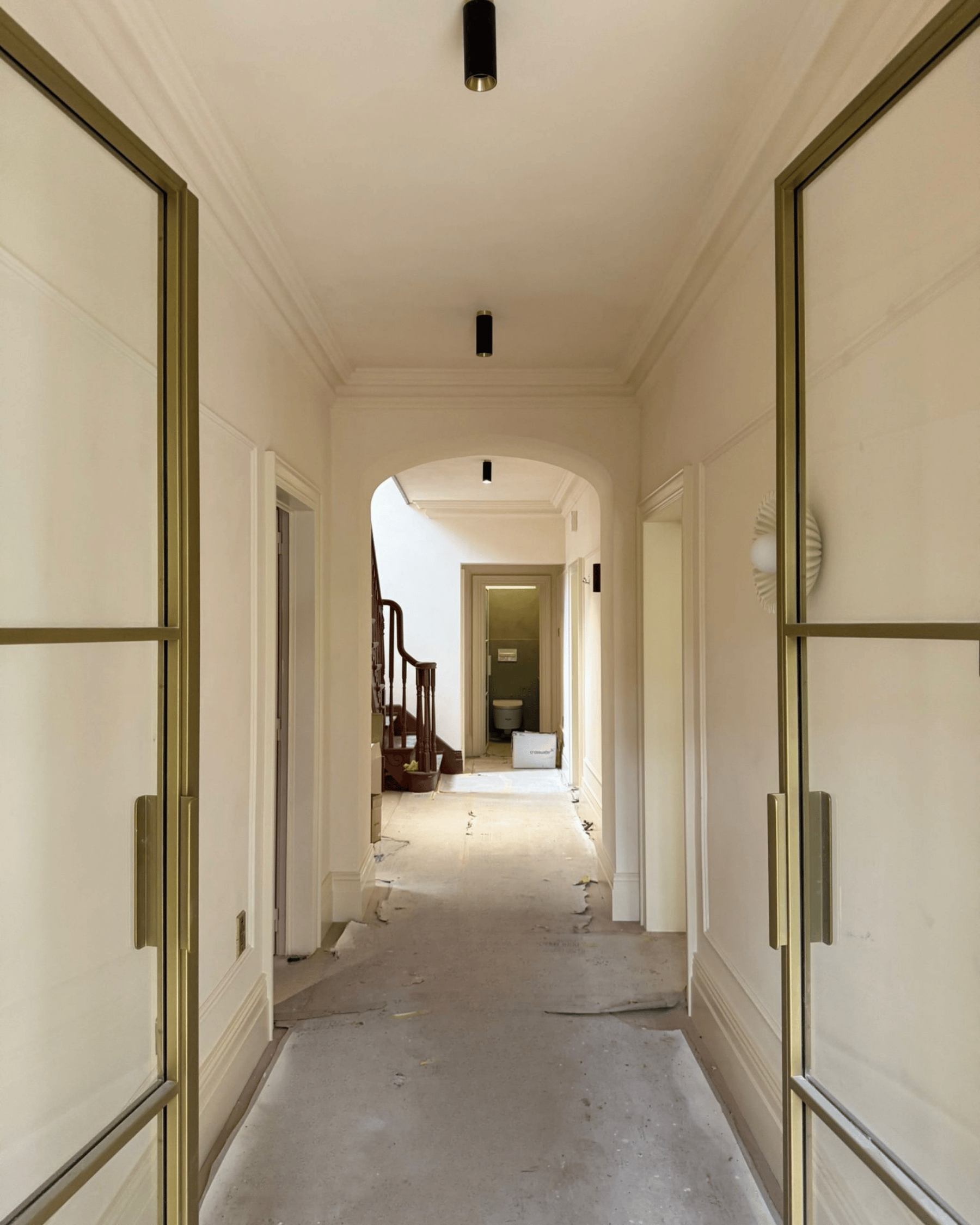
For the renovation of this classic terraced house, colour, material choice, and finishes were carefully considered to work in harmony — flowing seamlessly from the entryway through to the en-suite.
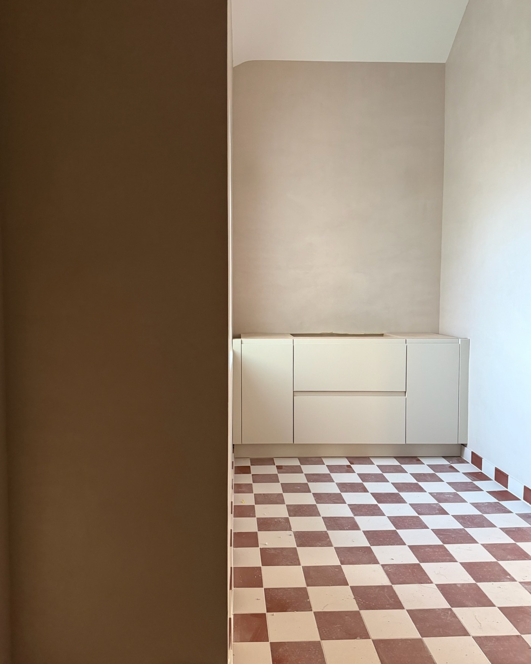
For the main living spaces, Estello was chosen as the unifying thread throughout the home, used across different paint systems to suit each surface.
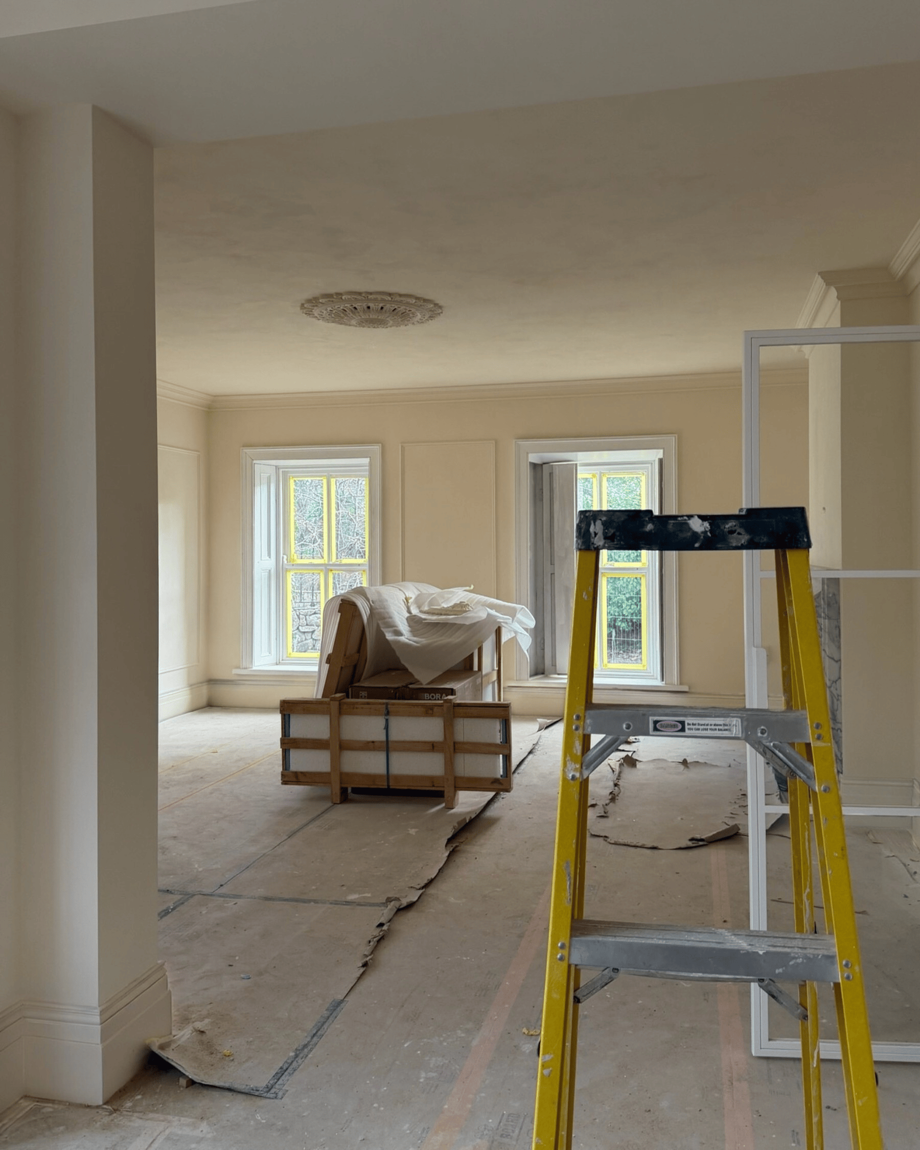
A warm off-white with a subtle butter-yellow undertone, Estello was selected to soften the formality of the house’s classic architecture and counterbalance the cooler quality of Irish light. It brings warmth without heaviness, reading as a gentle, luminous cream neutral that feels both calm and refined.
Lime paint’s mineral composition allows pigments to respond beautifully to their surroundings, shifting subtly throughout the day. In brighter rooms, Estello appears fresh and radiant; in softer or north-facing light, it deepens and warms, creating a more enveloping, lived-in atmosphere.
To enhance continuity and calm, full colour drenching was applied throughout the home. Walls and ceilings were finished in Estello lime paint, while skirting boards and architraves were painted in a matching Estello tone using a conventional paint finish. This approach allowed architectural details to blend seamlessly rather than compete for attention, while ensuring durability and performance on timber surfaces.
By removing contrast between surfaces, the eye moves more fluidly through the spaces, and proportions feel softened and balanced.
One of the most compelling qualities of Estello is how it behaves differently from room to room. Variations in light exposure — from coastal brightness to softer northern light — cause the same shade to read warmer, cooler, lighter, or more cocooning depending on the time of day.
Areas finished in Estello include:
In contrast to the warm restraint of Estello elsewhere in the home, the family room — to be used primarily as a TV and snug space — was designed to feel more intimate and gently enveloping.
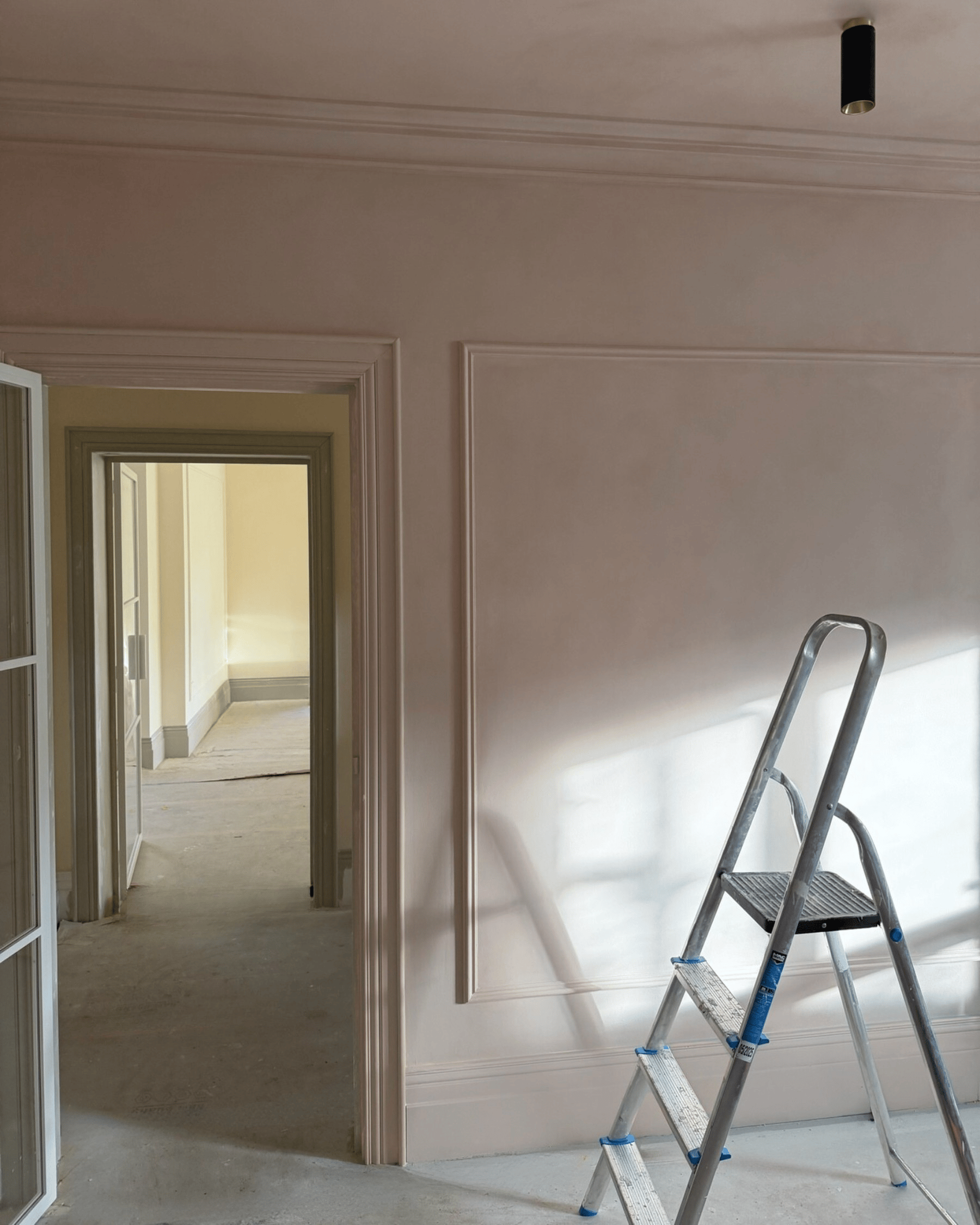
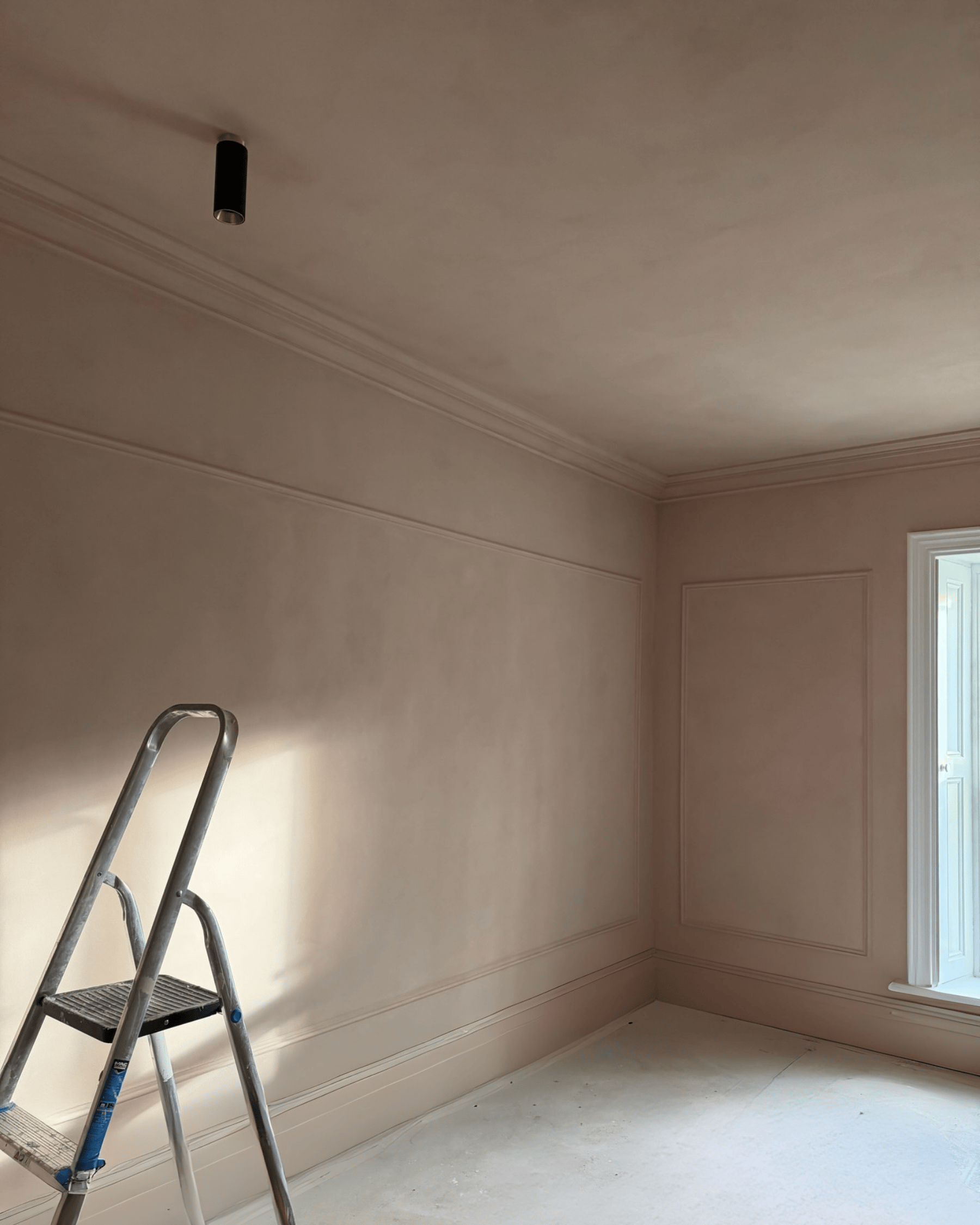
The colour Hortense was chosen to define the room. Applied in lime paint to the walls and ceiling, the finish brings subtle depth and surface variation, while the woodwork was painted in matching Hortense paint to create a sense of continuity and refinement.
A soft beige pink with antique rose undertones, Hortense is a great alternative to classic neutrals. It introduces warmth and personality without overwhelming the space, making it well suited to a room intended for lounging and slower, more restful moments.
As daylight fades, the character of the colour shifts. What feels light and quiet during the day becomes richer and more atmospheric in the evening, enhancing the sense of comfort and focus that suits a TV room particularly well. The mineral quality of the lime finish heightens this cocoon effect, giving the space a tactile, softly layered feel.
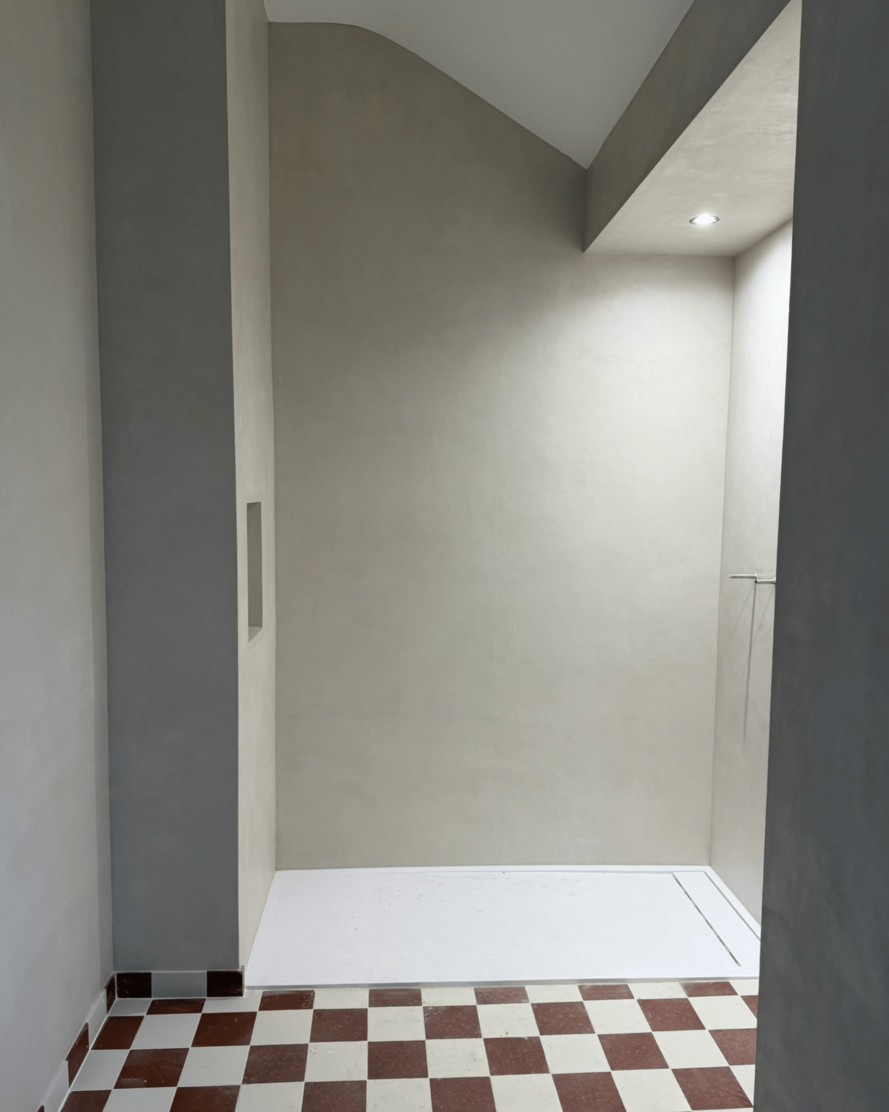
All three bathrooms were finished in microcement, using our bestselling shade Écume. A soft mineral off-white that sits gently between white and beige, Écume was an ideal choice for these spaces. Its subtle warmth reflects light beautifully without ever feeling stark or clinical—bringing softness and balance to rooms that are often defined by hard surfaces.
Each bathroom was designed to feel serene, tactile, and quietly luxurious, with an emphasis on continuity, material depth, and restraint.
Main Family Bathroom
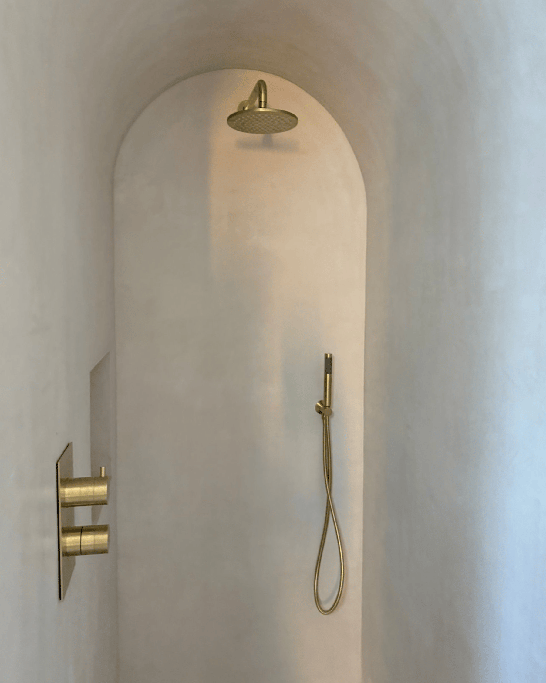
The main family bathroom is finished entirely in Écume microcement, applied to all walls and carried seamlessly into a fully enclosed arched shower. The ceiling is colour-matched in Écume paint, reinforcing a sense of enclosure and visual calm. The arched shower reads as both sculptural and immersive, with the uninterrupted microcement surface allowing form and texture to take centre stage.
Master En-Suite
In the master en-suite, Écume microcement is used across the walls and shower area, with the ceiling finished in a matching Écume paint. The restrained palette and seamless application create a soothing, spa-like atmosphere—refined, restorative, and intentionally understated.
Guest En-Suite
The guest en-suite continues the same Écume microcement and paint system, ensuring a consistent visual language across the home’s private spaces.
Using a single shade across walls, showers, and ceilings creates a strong sense of cohesion and ease. Écume’s gentle tonal variation introduces depth and tactility without visual noise, enhancing the calm, spa-inspired quality of each bathroom.

The smallest room in the house was treated with the same level of care and consideration as the rest of the project.
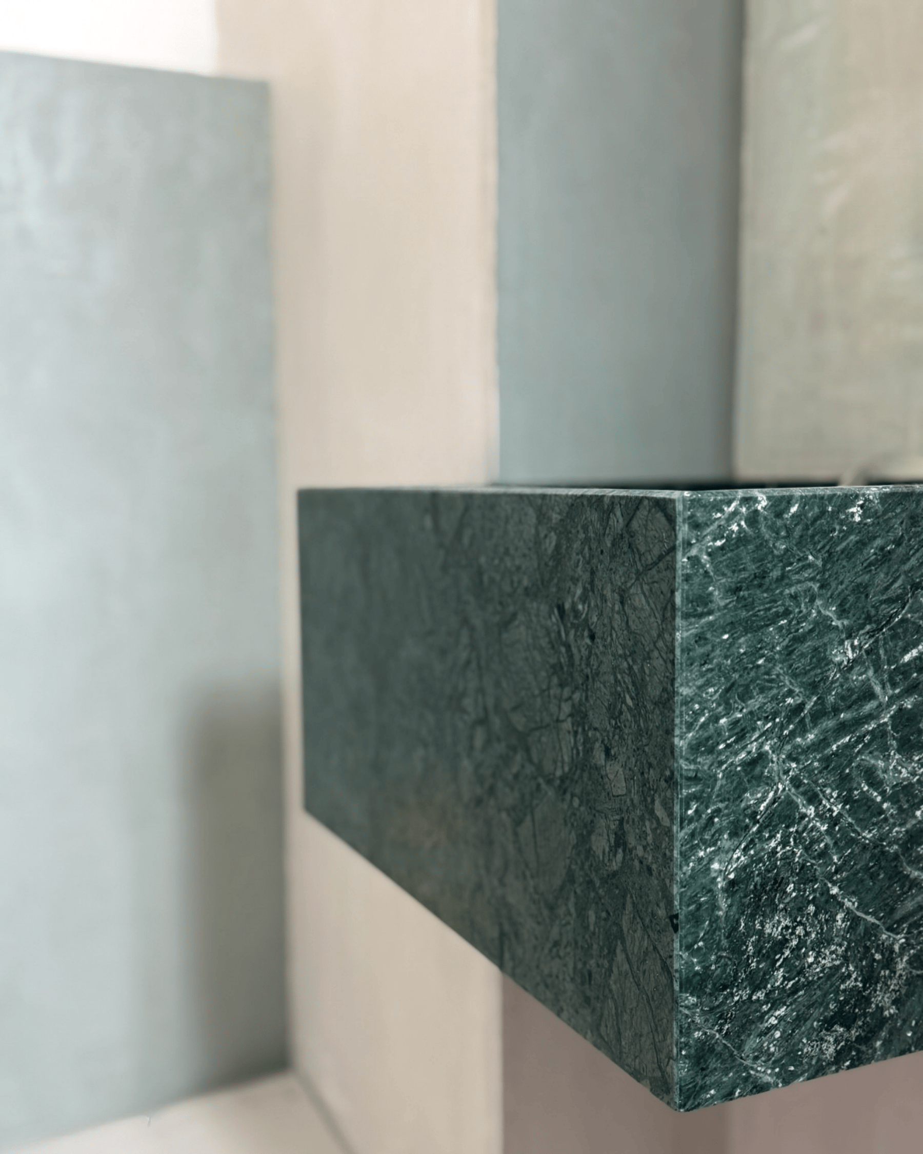
In the guest WC, the colour Agave—another bestseller—was introduced as a moment of richness and contrast. A muted, earthy green with a hint of grey, inspired by natural mineral tones, the colour appears in matching microcement within the toilet recess and inside a beautiful arched niche, framing a striking green marble sink.
The walls and ceiling are finished in matching Agave lime paint, enveloping the space in colour and texture.
Agave brings depth and warmth to this compact room. The effect is intimate and quietly dramatic, with the interplay of microcement, lime paint, and stone creating a layered, luxurious feel that remains restrained rather than theatrical.
Light Variability:
One of the key challenges was ensuring the finishes performed beautifully across rooms with very different orientations and light conditions. Lime paint and microcement were chosen specifically for their living, mineral quality—allowing colours to shift subtly throughout the day and respond naturally to changing light.
Respecting the Building’s Heritage:
Every stage of preparation and application was carried out with sensitivity to the home’s original fabric. Contemporary finishes were carefully integrated so they would sit comfortably alongside the existing detailing, enhancing rather than competing with it.
Material & Colour Consistency:
Careful colour matching across lime paint, microcement, and traditional paint was essential to maintaining visual cohesion. This attention to detail ensured a seamless flow from room to room, reinforcing the sense of calm continuity throughout the home.
The finished home feels warm, grounded, and quietly confident. Texture replaces ornamentation, and light becomes an integral part of the design. Every surface contributes to a sense of calm continuity, while subtle variations in colour and finish keep the spaces engaging and alive.
Perhaps the greatest challenge—and achievement—of this renovation was ensuring the house retained its sense of soul after a full transformation. Through the use of breathable, mineral finishes and a carefully considered palette, the house retains a sense of depth and character, rather than feeling overly perfected or newly imposed.
This project is a beautiful example of how lime paint, microcement, and thoughtful colour selection can transform a traditionally built home—enhancing its heritage and atmosphere rather than competing with it.
A true collaboration rooted in craftsmanship, restraint, and timeless design.
Our very last major project of 2025 was commissioned by the talented Lynne O’Loughlin, the Galway-based, award-winning designer behind Lynne O’Loughlin Design.
Set within a beautifully proportioned terraced house near Galway’s promenade, this full renovation is about balance: honouring the building’s original character while gently introducing contemporary comfort, warmth, and subtle texture.
Through carefully considered finishes, colour drenching, and mineral-based materials, this classic house is being elevated to a comfortable, stylish home that feels deeply personal.
Let’s step inside.
The vision for this renovation was guided by a desire to respect the home’s heritage while adapting it for contemporary life. The brief focused on:
For the renovation of this classic terraced house, colour, material choice, and finishes were carefully considered to work in harmony — flowing seamlessly from the entryway through to the en-suite.
For the main living spaces, Estello was chosen as the unifying thread throughout the home, used across different paint systems to suit each surface.
A warm off-white with a subtle butter-yellow undertone, Estello was selected to soften the formality of the house’s classic architecture and counterbalance the cooler quality of Irish light. It brings warmth without heaviness, reading as a gentle, luminous cream neutral that feels both calm and refined.
Lime paint’s mineral composition allows pigments to respond beautifully to their surroundings, shifting subtly throughout the day. In brighter rooms, Estello appears fresh and radiant; in softer or north-facing light, it deepens and warms, creating a more enveloping, lived-in atmosphere.
To enhance continuity and calm, full colour drenching was applied throughout the home. Walls and ceilings were finished in Estello lime paint, while skirting boards and architraves were painted in a matching Estello tone using a conventional paint finish. This approach allowed architectural details to blend seamlessly rather than compete for attention, while ensuring durability and performance on timber surfaces.
By removing contrast between surfaces, the eye moves more fluidly through the spaces, and proportions feel softened and balanced.
One of the most compelling qualities of Estello is how it behaves differently from room to room. Variations in light exposure — from coastal brightness to softer northern light — cause the same shade to read warmer, cooler, lighter, or more cocooning depending on the time of day.
Areas finished in Estello include:
In contrast to the warm restraint of Estello elsewhere in the home, the family room — to be used primarily as a TV and snug space — was designed to feel more intimate and gently enveloping.
The colour Hortense was chosen to define the room. Applied in lime paint to the walls and ceiling, the finish brings subtle depth and surface variation, while the woodwork was painted in matching Hortense paint to create a sense of continuity and refinement.
A soft beige pink with antique rose undertones, Hortense is a great alternative to classic neutrals. It introduces warmth and personality without overwhelming the space, making it well suited to a room intended for lounging and slower, more restful moments.
As daylight fades, the character of the colour shifts. What feels light and quiet during the day becomes richer and more atmospheric in the evening, enhancing the sense of comfort and focus that suits a TV room particularly well. The mineral quality of the lime finish heightens this cocoon effect, giving the space a tactile, softly layered feel.
All three bathrooms were finished in microcement, using our bestselling shade Écume. A soft mineral off-white that sits gently between white and beige, Écume was an ideal choice for these spaces. Its subtle warmth reflects light beautifully without ever feeling stark or clinical—bringing softness and balance to rooms that are often defined by hard surfaces.
Each bathroom was designed to feel serene, tactile, and quietly luxurious, with an emphasis on continuity, material depth, and restraint.
Main Family Bathroom
The main family bathroom is finished entirely in Écume microcement, applied to all walls and carried seamlessly into a fully enclosed arched shower. The ceiling is colour-matched in Écume paint, reinforcing a sense of enclosure and visual calm. The arched shower reads as both sculptural and immersive, with the uninterrupted microcement surface allowing form and texture to take centre stage.
Master En-Suite
In the master en-suite, Écume microcement is used across the walls and shower area, with the ceiling finished in a matching Écume paint. The restrained palette and seamless application create a soothing, spa-like atmosphere—refined, restorative, and intentionally understated.
Guest En-Suite
The guest en-suite continues the same Écume microcement and paint system, ensuring a consistent visual language across the home’s private spaces.
Using a single shade across walls, showers, and ceilings creates a strong sense of cohesion and ease. Écume’s gentle tonal variation introduces depth and tactility without visual noise, enhancing the calm, spa-inspired quality of each bathroom.
The smallest room in the house was treated with the same level of care and consideration as the rest of the project.
In the guest WC, the colour Agave—another bestseller—was introduced as a moment of richness and contrast. A muted, earthy green with a hint of grey, inspired by natural mineral tones, the colour appears in matching microcement within the toilet recess and inside a beautiful arched niche, framing a striking green marble sink.
The walls and ceiling are finished in matching Agave lime paint, enveloping the space in colour and texture.
Agave brings depth and warmth to this compact room. The effect is intimate and quietly dramatic, with the interplay of microcement, lime paint, and stone creating a layered, luxurious feel that remains restrained rather than theatrical.
Light Variability:
One of the key challenges was ensuring the finishes performed beautifully across rooms with very different orientations and light conditions. Lime paint and microcement were chosen specifically for their living, mineral quality—allowing colours to shift subtly throughout the day and respond naturally to changing light.
Respecting the Building’s Heritage:
Every stage of preparation and application was carried out with sensitivity to the home’s original fabric. Contemporary finishes were carefully integrated so they would sit comfortably alongside the existing detailing, enhancing rather than competing with it.
Material & Colour Consistency:
Careful colour matching across lime paint, microcement, and traditional paint was essential to maintaining visual cohesion. This attention to detail ensured a seamless flow from room to room, reinforcing the sense of calm continuity throughout the home.

The finished home feels warm, grounded, and quietly confident. Texture replaces ornamentation, and light becomes an integral part of the design. Every surface contributes to a sense of calm continuity, while subtle variations in colour and finish keep the spaces engaging and alive.
Perhaps the greatest challenge—and achievement—of this renovation was ensuring the house retained its sense of soul after a full transformation. Through the use of breathable, mineral finishes and a carefully considered palette, the house retains a sense of depth and character, rather than feeling overly perfected or newly imposed.
This project is a beautiful example of how lime paint, microcement, and thoughtful colour selection can transform a traditionally built home—enhancing its heritage and atmosphere rather than competing with it.
A true collaboration rooted in craftsmanship, restraint, and timeless design.